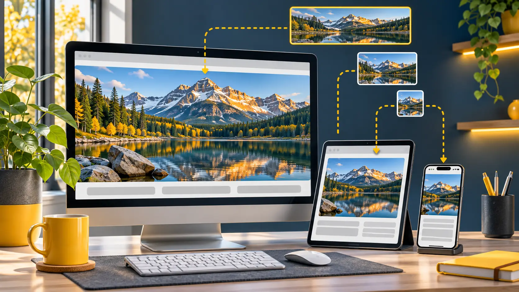
A small file can still be the wrong file. If a narrow card downloads a photograph thousands of pixels wide, visitors receive data they cannot use. Compression and responsive sizing solve different parts of the problem: one reduces bytes, the other avoids sending unnecessary pixels.
WordPress creates variants
A normal upload can produce several sizes. When a theme uses WordPress image functions, the markup usually includes srcset and sizes so the browser can choose a suitable variant.
Several files in the uploads directory do not prove that visitors receive a suitable one. The theme needs to output useful srcset and sizes values for each component. Inspect a card, article image and hero separately because templates may render them in different ways. A hard-coded original URL bypasses the usual WordPress selection even when smaller variants exist.
Inspect the file actually downloaded
Use browser developer tools on a phone-sized viewport. Compare the displayed image width with the downloaded file dimensions and bytes. A CSS background does not automatically benefit from WordPress srcset markup.
Use currentSrc or the network request URL to see what the browser actually chose, rather than relying only on the src attribute in the page source. Repeat the check at another viewport width. A high-density display can reasonably request a variant wider than its CSS box, so compare visual sharpness and transferred bytes together. The goal is to avoid a clearly oversized file without making the image soft.
Check each page component
- HTMLLook for useful srcset and sizes values.
- NetworkSee which file the phone and desktop browser choose.
- QualityKeep enough detail without sending pixels the layout cannot use.
Separate resizing from compression
Selecting thumbnails for API compression does not create missing sizes for old media. If your theme changes its sizes, regenerate old thumbnails with an appropriate WordPress workflow.
Changing a theme may introduce image sizes that older uploads do not have. Test thumbnail regeneration on a few attachments and check available disk space before running it across the whole library. Then revisit live pages to confirm the new candidates are used. API compression reduces existing files; it cannot create a missing size or correct an inaccurate sizes attribute by itself.
Measure on different screens
For first-screen images, see how to find the image delaying a page.
Compare the same page on mobile and desktop. Check sharpness as well as transfer size. The goal is a sensible file for each layout, not the smallest possible byte count.
Inspect a mobile card, a full article image and the first-screen banner independently. Record the requested URL, pixel dimensions and transferred bytes for each. If a variant looks blurred, check the source resolution and display density before increasing compression. A good configuration provides enough detail for the component while avoiding pixels the layout cannot use.
A practical example
Open a roughly 320-pixel card in a phone-sized viewport and inspect the Network panel. If the browser downloads a 2,400-pixel original, review the final srcset and sizes attributes. Remember that CSS background images do not automatically use WordPress image candidates in HTML.
Before you publish
- Compare the downloaded URL and dimensions on mobile and desktop.
- After changing themes, check whether older media needs regenerated sizes.
- Judge sharpness in the actual page component as well as transfer size.
Explore more
Check the result on your own website and keep an original when you may need to restore it.